Thursday, February 21, 2008

Weekly Scrapping Tips: Buttons Buttons!

One of the services I offer at Scrap Fancy is custom scrapbooking, meaning customers commission me to make a scrapbook or an altered project for them. This is one of the projects I just completed, an altered frame for a baby shower gift.


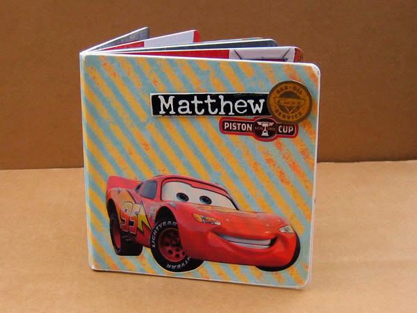
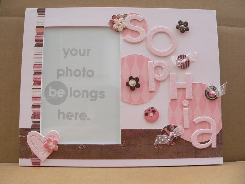
I started with a frame from Creative Imaginations' Bare Elements line, and went with a pink and brown color scheme (one of my favorites - pink and brown are Scrap Fancy's colors).

I started with the pink cardstock base layer, and then added the vertical striped strip and the horizontal brown strip. Then I added 3 pink circles (things look better in odd numbers groupings) to the frame. I let the circles run off the edges of the frame, just trimming the excess that hung over - I find that things just look more pleasing to the eye when you let them overlap or break out of the box. I liked that it was all different shades of pink, so it was subtle, but added some interest and depth to the background. To keep things looking harmonious, I kept all the circles' argyle patterns running in the same direction.

Since the frame was for a baby girl I wanted something sparkly and fun, so I used these Doodlebug chipboard alphas to personalize the frame with baby's name - the letters are pre-glittered and look like they're coated in sugar! The cute heart in the bottom left corner also comes from that set.

To add more dimension, I scattered buttons around the name, and layered on top of the heart. These pretty buttons by Making Memories are actually made of chipboard with an epoxy coating to make them glossy. These buttons are great because they are lightweight and have pretty coordinated patterns, making it really easy to spruce up a page or project. However, I am one of those people who likes her buttons threaded - though I don't always do it, it bugs me when I leave the button holes naked! So in this case I used embroidery thread and sheer ribbon to thread the button holes. This created a challenge when sticking the buttons to the frame. Normally I'd use glue dots for the job, but the thread and ribbon can cause a really lumpy backside, making it hard for the glue dot to securely stick to both the button and the frame. The answer - Pop Up Glue Dots! They are really thick, so they just mold to the lumpy backsides of the buttons, and stick securely to the frame, and add nice dimension by raising the buttons off the frame a bit! Using the right adhesive for the right job makes all the difference in the world. I think I must use over 8 different adhesives in my scrapbooking, ranging from liquid glues to acid-free, double-sided tape, depending on my needs!

Well that about does it for this project. Thanks for tuning in for my tips - hope they help! Happy scrapping!

Wednesday, February 20, 2008

What Color are You?

Take this test!
You're blue — the most soothing shade of the spectrum. The color of a clear summer sky or a deep, reflective ocean, blue has traditionally symbolized trust, solitude, and loyalty. Most likely a thoughtful person who values spending some time on your own, you'd rather connect deeply with a few people than have a bunch of slight acquaintances. Luckily, making close friends isn't that hard, since people are naturally attracted to you — they're soothed by your calming presence. Cool and collected, you rarely overreact. Instead, you think things through before coming to a decision. That level-headed, thoughtful approach to life is patently blue — and patently you!

Wednesday, February 13, 2008

Weekly Scrapping Tutorial & Tips: *Gasp* The Fashionista makes a themed album...

I know, I know! I've been MIA so long you probably think I disappeared for good. Well, as it so happens, DH and I sold the house and moved since the last post, so after settling in and getting my ebay store back up and running, I have returned to blogland.

To make amends, I thought I would start a new weekly blog feature: scrapping tutorial and tips (p.s. - I reserve the right to rename it when I come up with something more imaginative)!

Once a week I will post a project and share hints and tips with you. The idea is not to give you a step-by-step recreation of the specific project, but rather to share techniques or tips, and a bit of my creative process so that you can use them in lots of different projects.

This week's project is a board book I made for a little boy who loves the movie "Cars." This was actually somewhat of a stretch for me, because I'm not a big themed-product scrapbooker. I have been dubbed a scrapping fashionista for my love of the latest sophisticated embellishments and artistic papers, so I really enjoyed the challenge here of incorporating the theme while not letting it override all sense of design and creativity!

First I chose the products I wanted to use, starting with the themed stickers. Using the colors and style of these stickers, I chose some papers - red and gray distressed paper to coordinate with Lightning McQueen. This striped paper brightened things up and gave a sense of movement. I used distressed papers because much of the movie was set in Radiator Springs, which was run down and dusty.

I put Lightning McQueen on the bottom of the cover, to give it some visual weight there, and I clustered the boy's name with some stickers in the top corner of the cover, so that those elements would not just be scattered randomly. Note that Lightning McQueen is facing toward the opening of the book - I find this helps direct your eye toward opening the book. The direction of the striped paper also reinforces this.

I continued the distressed look by inking the edges of the kraft photo mats. Using the same color scheme throughout the book, and using some of the same papers from page to page keeps everything feeling cohesive and coordinated in a mini album.

Creating a visual triangle helps the pages feel unified, and tells the eyes where to go. In the above photo, notice the red paper and the grid transparency on the left side are repeated in the two circles on the right page.

I couldn't find Cars themed scrapbook paper when I was shopping, which turned out to be a blessing. I think themed stickers AND themed paper could have been overwhelming here. The papers I used actually have nothing to do with cars or the movie at all. The stripe is from My Minds Eye, and the red and grey papers are from Basic Grey's Scarlet's Letter collection. The grid transparency is a Hambly overlay. You wouldn't think to use them on a scrapbook with a Disney animated movie theme, but they work! Keep an open mind when shopping for paper and embellishments - try seeing beyond the theme or the collection the papers come from when searching for the perfect match for your project.

I kept all the cars in the book on the bottom, so the pages would feel grounded. Floating cars all over would just say "sticker sneeze" and feel too overtly themed, I think.


Well that's it for my first scrapping tutorial feature! Hope you found it useful and interesting. If you have any questions or feedback, I'd love to hear it!